Platforms : Web, iOS and Android (using Sencha)
Responsibilities : Strategy and Feature Design, Hiring, Branding, UX Wires, Prototyping, User Research
Additional UX Document : User Persona and Needs Document
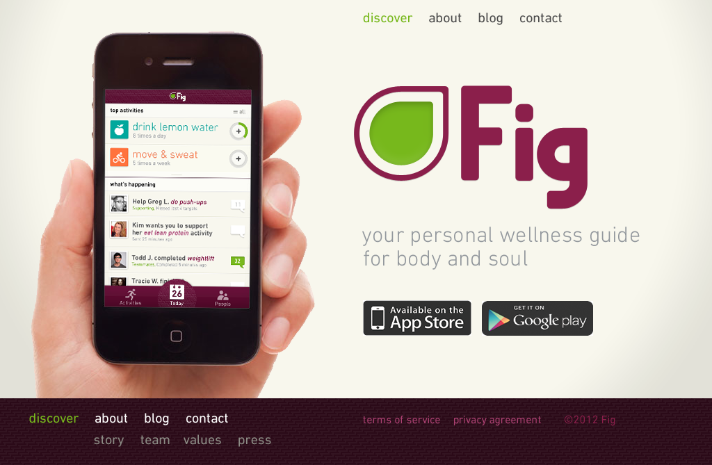
I joined Fig.com in May 2012 as their 2nd employee and the Head of User Experience. I immediately worked with the two co-founders to get a new engineering team hired and began a rebuild of the entire system. I redesigned the entire application and worked with the two cofounders on a strategic vision for this product – which was originally conceptualized as a playful way for folks to live holistically healthier lives. Breaking down healthcare content to micro-formats, the idea was to use mobile phones to actively encourage users to remain on healthy living plans – including areas of wellness usually not addressed by quantified health apps, like emotional and spiritual practices. Using game play as reward and encouragement the app would be fun, light, and rewarding, while also integrating social apis to enable personal relationships to become champions for your plan.
While there, I created all website, mobile app specifications, and worked with the cofounders on product features and strategy. I conducted user testing plans, helped to guide all branding development working with a third party agency, and collaborated with a contracted visual designer for asset production. Unfortunately, the concluded upon vision of the business model and growth adoption was very hard for me to invision growing successfully after the initial launch. The alpha version of the product had consumed quite a bit of funding for what was produced in the year and 1/2 before I joined. Five months after I left, unable to secure more funding, the co-founders decided to halt efforts on the product for sometime.
It’s unfortunate that this app came a little too late in the lifecycle of learning for the company and that we were not able to implement some more of the features which I think would have helped with growth, virility, and playfulness – mastery, leveling, etc. However I was very happy, given those strategic constraints, with the design which was produced and some of the features such as using a madlibs metaphor to help users commit to action plans and playful egg-hunt animations used as feedback for goal achievement. It received great design reviews, as such, in the app stores by the initial users. The app is still available via the app store links on the website above.
